End the rainbow! Oh, wait.
It’s been a while now since there is a growing understanding that rainbow color palettes can negatively impact how accurately we perceive and interpret data visualizations. Rainbow maps have been linked to lower accuracy and are not readable by color-blind readers. This gave rise to the #EndTheRainbow movement among many scientists across various fields.
Some people might not know this, but a team at Google has come to rescue the rainbow lovers. A couple of years ago, they created Turbo, An Improved Rainbow Colormap for Visualization. It seems turbo is distinguishable and smooth for all types of color blindness conditions, except Achromatopsia (total color blindness).
The turbo color palette is now available in R with the viridisLite
package. Here is a quick demonstration:
library(viridisLite)
library(ggplot2)
library(patchwork)
library(dplyr)
library(reshape2)
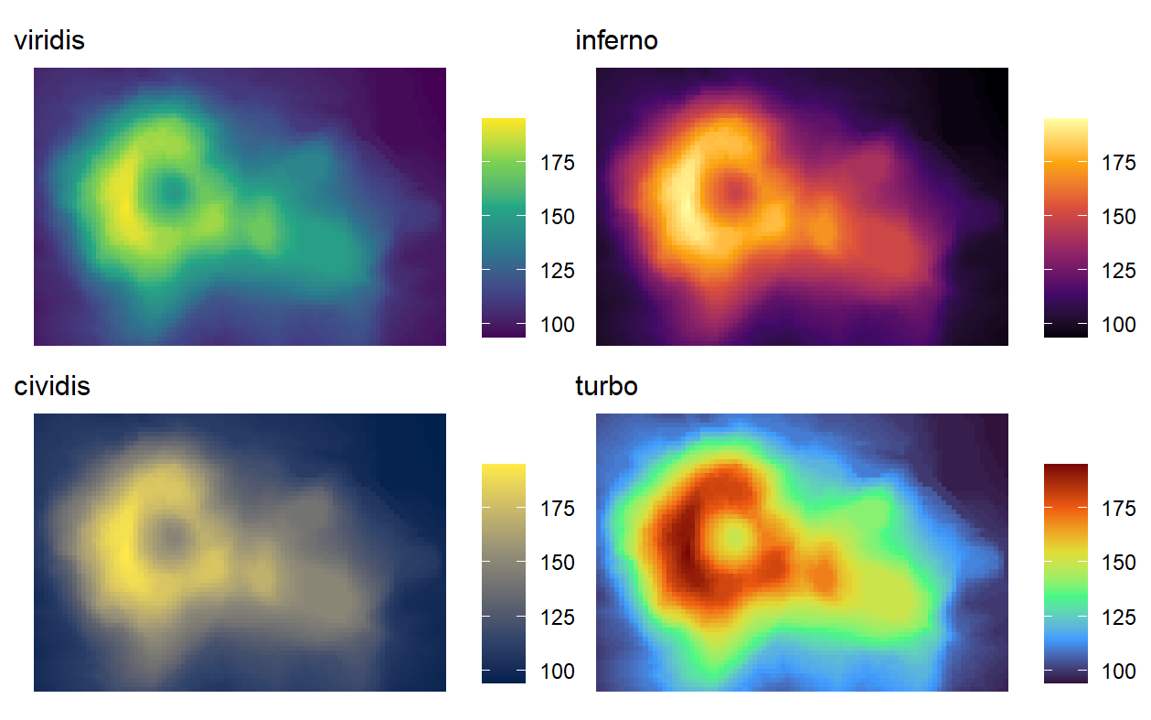
plot_list <- lapply(X=c('viridis', 'inferno', 'cividis', 'turbo'),
FUN=function(i){
volcano %>%
melt() %>%
ggplot() +
geom_tile(aes(x = Var1, y = Var2, fill = value)) +
scale_fill_viridis_c(option = i) +
labs(subtitle = paste0(i), fill='') +
#coord_fixed() +
theme_void()
}
)
# patch plots together
plot_list[[1]] +
plot_list[[2]] +
plot_list[[3]] +
plot_list[[4]]
ggsave(filename='turbo_test.png', dpi=200,
width = 16, heigh=10, units='cm')
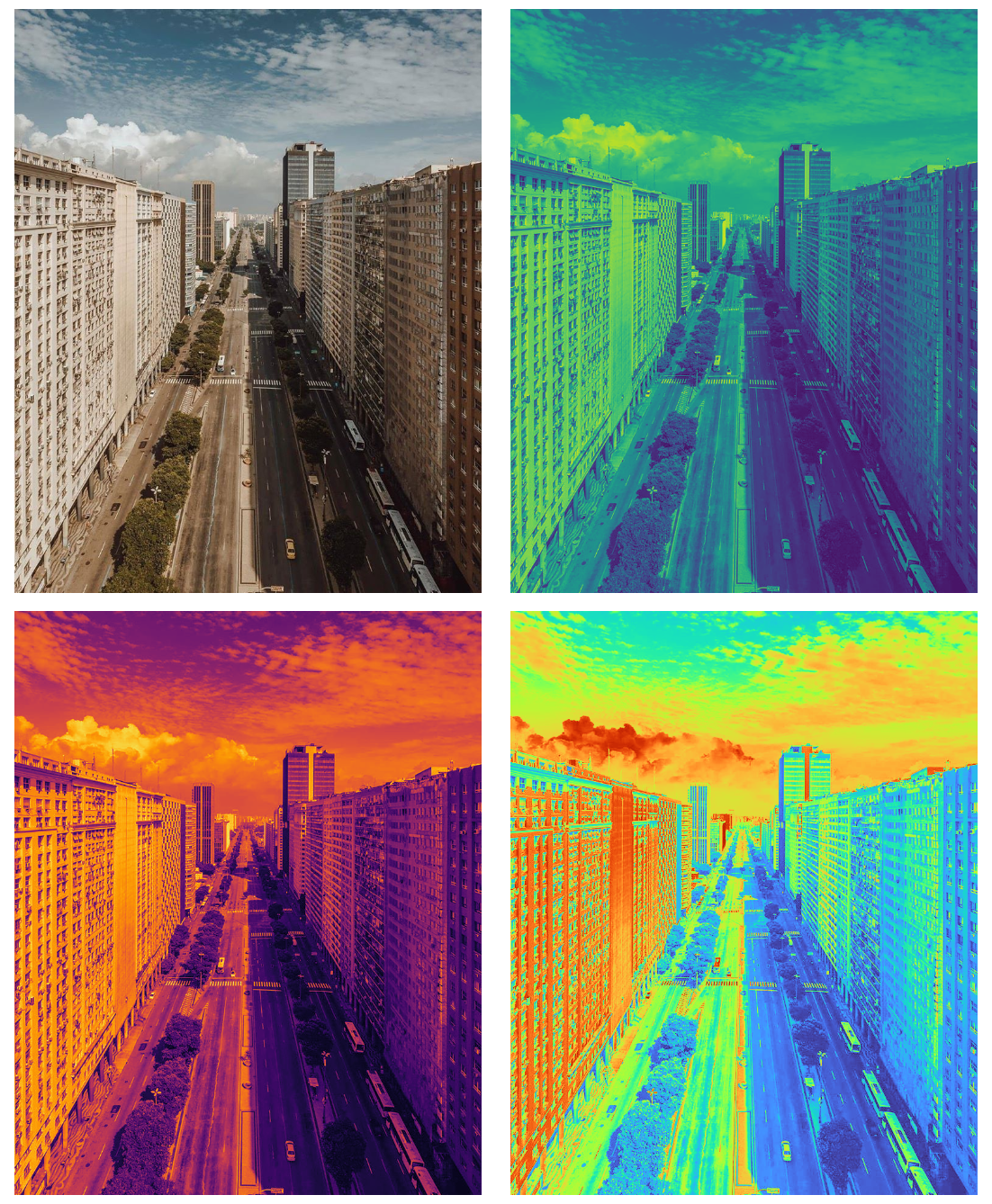
Before we get too excited, even the turbo rainbow palette exaggerates the colors a bit. See below. If your data visualization involves really smooth and detailed transitions, you should probably stick to the #EndTheRainbow movement.
library(imager)

my_photo <- load.image('https://www.urbandemographics.org/img/post_images/urban_picture_rio_lucasmagno.jpg')

# color palettes
p_viridis <- scales::gradient_n_pal(viridisLite::viridis(n=1000))
p_inferno <- scales::gradient_n_pal(viridisLite::inferno(n=1000))
p_turbo <- scales::gradient_n_pal(viridisLite::turbo(n=1000))

# plot
png("turbo_test_rio.png", units="cm", width=14, height=17, res=200)
# insert ggplot code

par(mfrow=c(2,2), mai = c(.05, 0.05, .05, 0.05))

plot(my_photo, axes=FALSE)
grayscale(my_photo) %>% plot(colourscale=p_viridis,rescale=FALSE, axes=FALSE)
grayscale(my_photo) %>% plot(colourscale=p_inferno,rescale=FALSE, axes=FALSE)
grayscale(my_photo) %>% plot(colourscale=p_turbo,rescale=FALSE, axes=FALSE)

dev.off()