An animated 3D hologram of population density
Some of you might have read the title of this post and thought about all the recent advances in computational models and data visualizations we have seen over the past few years. Right?
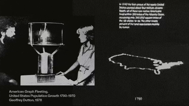
Well, this is a 3D hologram created in 1978 (!) showing how the population density of the US changed between 1790-1970. It was created by Geoffrey Dutton at the Harvard Lab for Computer Graphics and Spatial Analysis. This is a gem found by James Cheshire, who wrote a really good post on Joy Division, Population Surfaces and Pioneering Electronic Cartography.
ps. My jaw also dropped when I first saw this gif below. What an incredible effort it must have been to create this back then, something many of us take for granted today.