Spatial, income and racial inequalities in access to COVID-19 healthcare
Using the new balanced floating catchment area approach (BFCA)
I’m very glad to share our new paper analyzing spatial, income and racial inequalities in access to COVID-19 healthcare using the new balanced floating catchment area approach (BFCA). I have summarized the key findings and contributions of the study in the Twitter thread, but please feel free to read the full paper. Manuscript PDF and code available here.
- Pereira, R. H., Braga, C. K. V., Servo, L. M., Serra, B., Amaral, P., Gouveia, N., & Paez, A. (2021). Geographic access to COVID-19 healthcare in Brazil using a balanced float catchment area approach. Social Science & Medicine, v273, 113773.
Abstract:
The rapid spread of COVID-19 across the world has raised concerns about the responsiveness of cities and healthcare systems during pandemics. Recent studies try to model how the number of COVID-19 infections will likely grow and impact the demand for hospitalization services at national and regional levels. However, less attention has been paid to the geographic access to COVID-19 healthcare services and to hospitals’ response capacity at the local level, particularly in urban areas in the Global South. This paper shows how transport accessibility analysis can provide actionable information to help improve healthcare coverage and responsiveness. It analyzes accessibility to COVID-19 healthcare at high spatial resolution in the 20 largest cities of Brazil. Using network-distance metrics, we estimate the vulnerable population living in areas with poor access to healthcare facilities that could either screen or hospitalize COVID-19 patients. We then use a new balanced floating catchment area (BFCA) indicator to estimate spatial, income, and racial inequalities in access to hospitals with intensive care unit (ICU) beds and mechanical ventilators while taking into account congestion effects. Based on this analysis, we identify substantial social and spatial inequalities in access to health services during the pandemic. The availability of ICU equipment varies considerably between cities, and it is substantially lower among black and poor communities. The study maps territorial inequalities in healthcare access and reflects on different policy lessons that can be learned for other countries based on the Brazilian case.
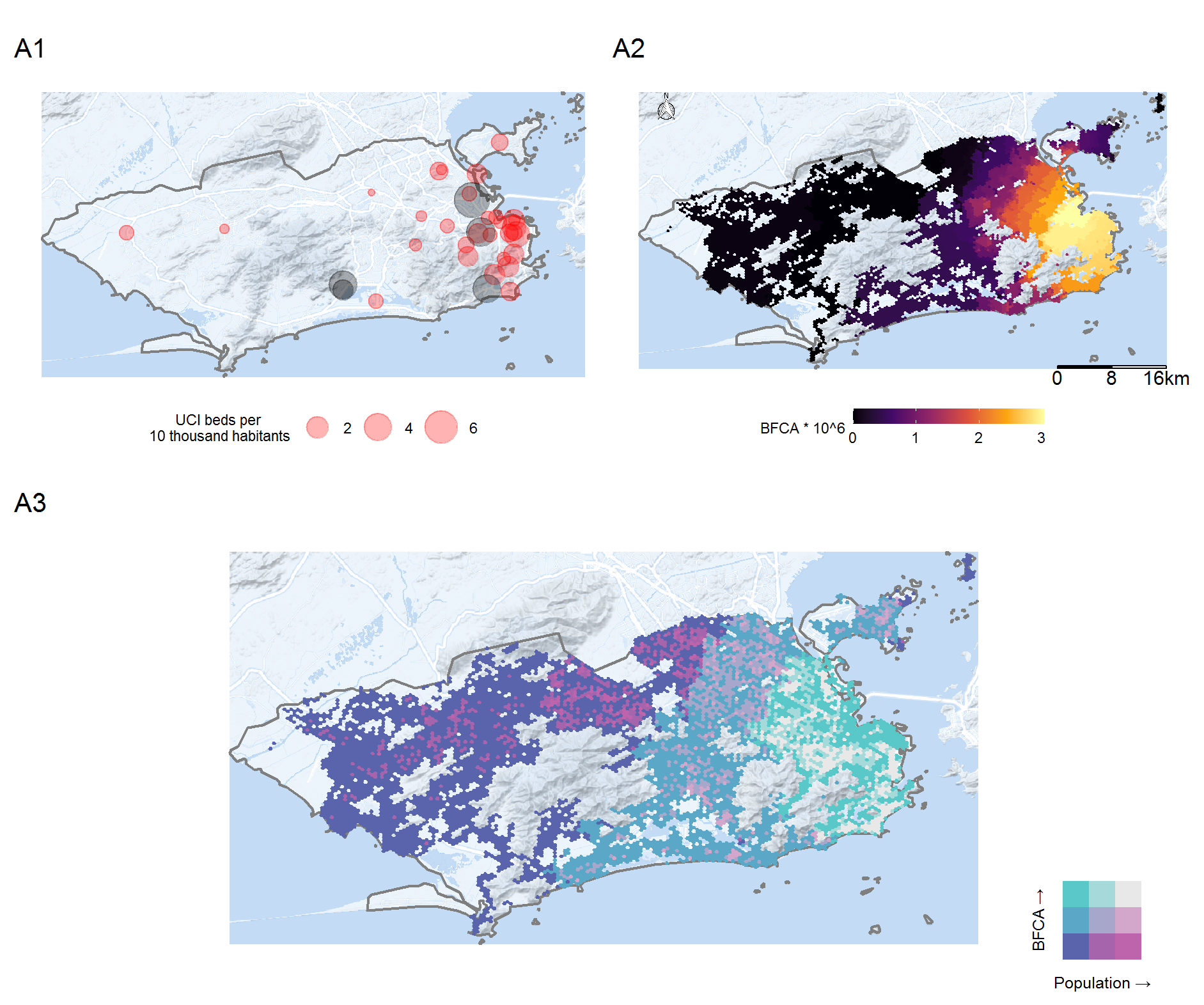
As a quick teaser, the image below depicts the city of Rio de Janeiro. It shows A1) The number of ICU beds per person in the catchment area of each hospital, A2) BFCA accessibility level with competition, A3) the combined spatial distribution of population ∩ accessibility. The bivariate choropleth map (A3) helps draw attention to places that deserve more (or less) attention:
- bright pink = areas with large population underserved by health services
- bright cyan = areas with small population with high access to health services
- dark purple = areas with small population with the lowest access to health