Mapping accessibility with data from the Access to Opportunities Project
The topic of day 4 in the #30DayMapChallenge is ‘Hexagons’. I thought this could be a good opportunity to show how one can download and map the data we generate in the Access to Opportunities Project.
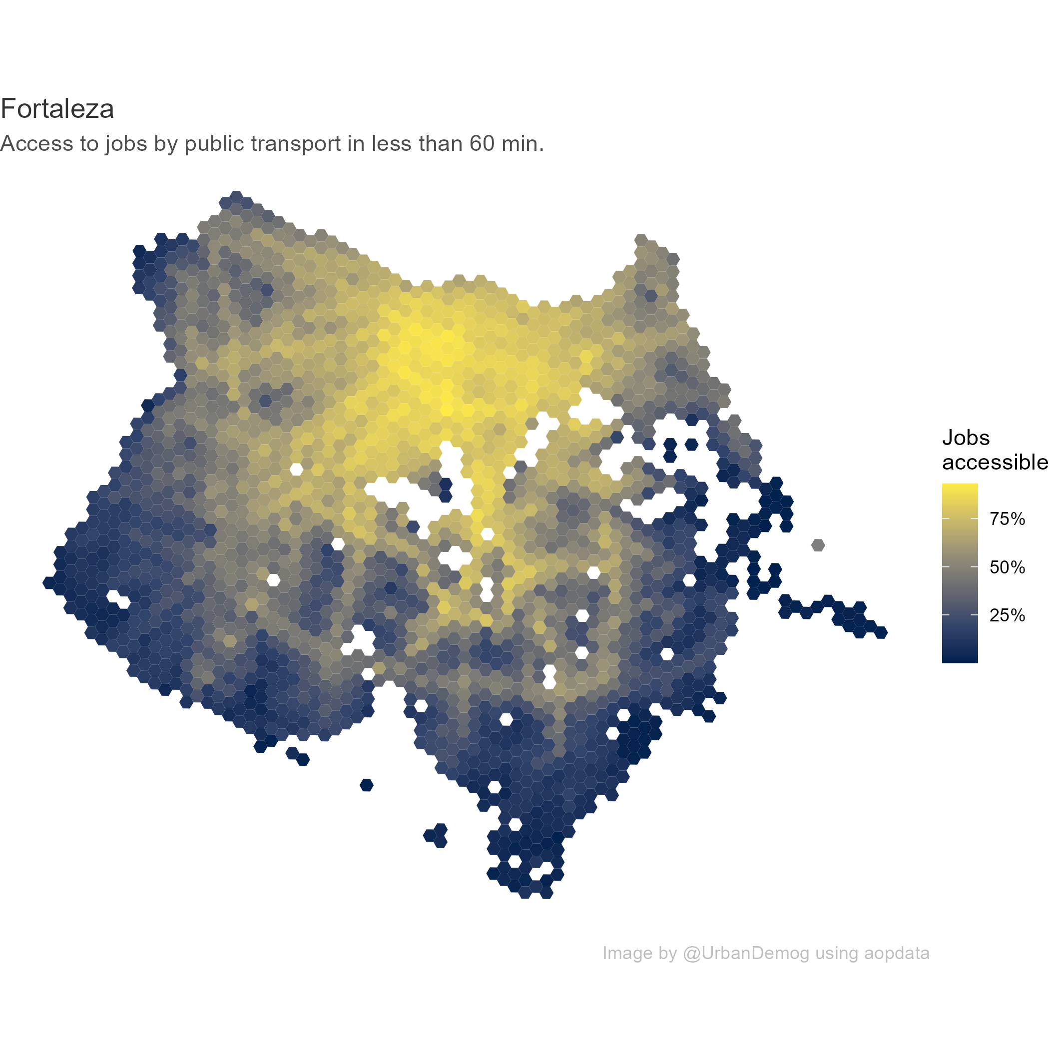
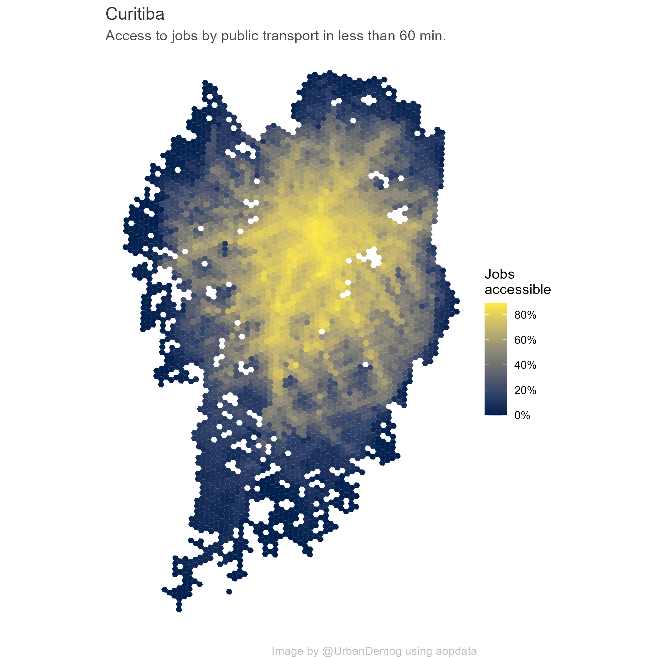
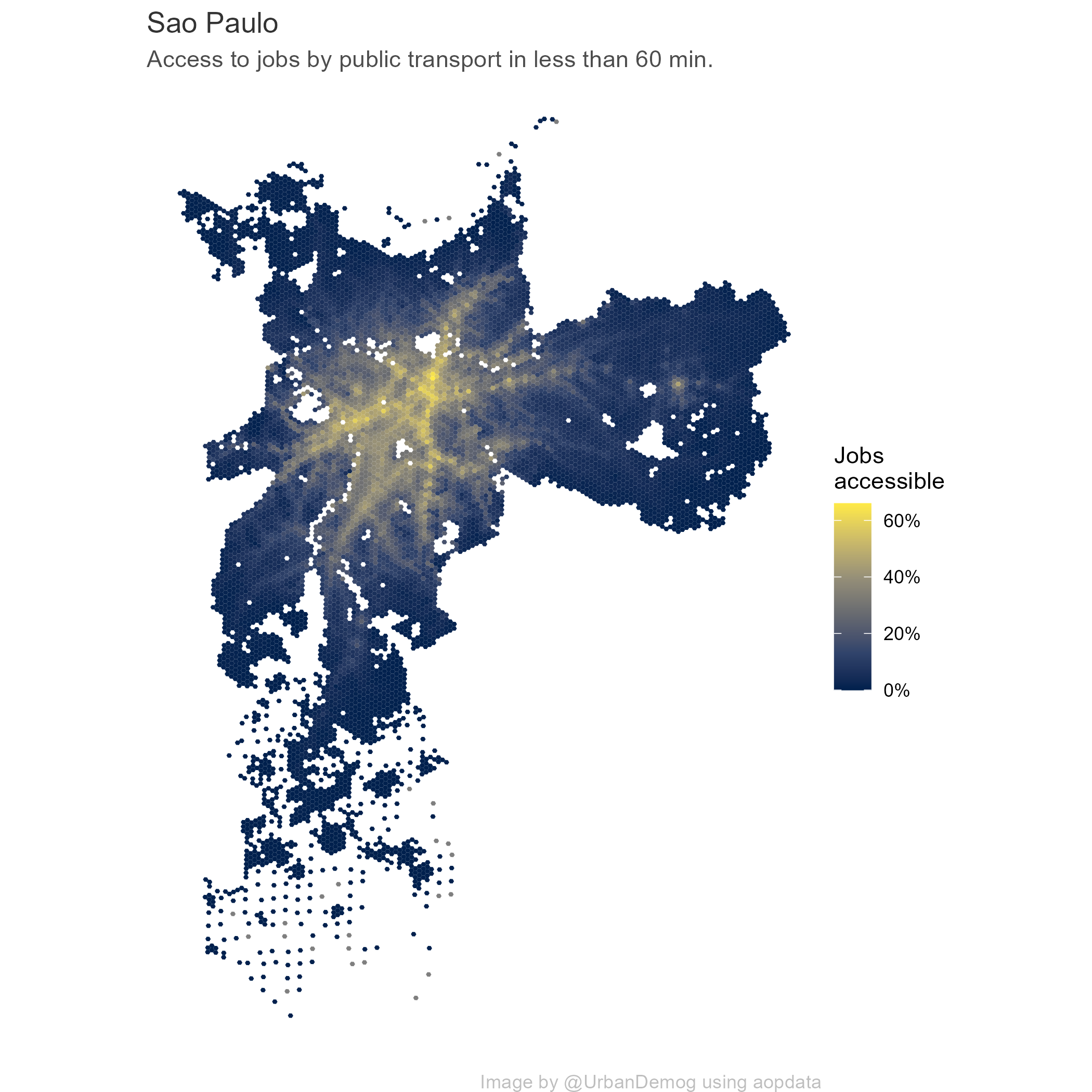
So here is a quick code snippet to map employment accessibility by public transport in some of Brazil’s cities. The data can be easily downloaded from the aopdata package.
library(aopdata)
library(ggplot2)

# download data
cities_list <- c('Fortaleza', 'Curitiba', 'Sao Paulo', 'Porto Alegre')
a <- read_access(city=cities_list, mode = 'public_transport', geometry = T)

# function to generate plots
  save_plot <- function(i){ # i="Sao Paulo"

    # select city
    temp_df <- subset(a, name_muni== i)
    temp_df <- subset(temp_df, P001 > 0)

    temp_fig <- ggplot() +
                  geom_sf(data=temp_df, aes(fill=CMATT60), color=NA) +
                  scale_fill_viridis_c(option = "cividis", labels=scales::percent) +
                  labs(subtitle='Access to jobs by public transport in less than 60 min.',
                        title=paste0(i) ,
                       fill="Jobs \naccessible",
                       caption = 'Image by @UrbanDemog using aopdata') +
                  theme_void() +
                  theme(plot.title = element_text(color = "gray20"),
                        plot.subtitle = element_text(color = "gray30"),
                        plot.caption = element_text(color = "gray")
                  )
    # save
    ggsave(temp_fig, filename = paste0(i,'.png'), width = 7, height = 7, dpi=300)

  }

# run :)
lapply(X=cities_list, FUN=save_plot)